Logos
The GINC logo in its two forms, each for a light and a dark ground, and the mark of each GINC site.
GINC




Site marks
One for each GINC site. The drawn marks are the ones in use; the same marks in colour are kept as the alternative.















Fonts
One typeface for everything, one more for monospaced text only, and a standard for each place type is set: a screen, a page, a card.
Aa
Alliance No.2
Every heading and all text, on every GINC site, report and card.
300400600700800
Aa
Geist Mono
The standard for monospaced text, and for that only: code, a value such as a colour's, and the speech-as-bars panel. Never for headings or running text.
400500
Sites and apps, on a screen. Text is set tight: −0.04em on body text, −0.05em on headings.
- Page titleBold · 36px, 60px on a wide screen · tighter
- National capability
- Section titleBold · 24px to 30px
- The shape of the register
- HeadingSemibold · 16px
- National top 100
- LeadRegular · 18px
- The infrastructure each nation depends on, as one register.
- BodyRegular · 14px on 24px
- Every asset competes on its score, with no quota by sector.
- FigureSemibold · 30px · tabular figures
- 51,160
- CaptionRegular · 12px · grey
- Source · CEPII BACI, 1995 to 2024
Brand voice
How GINC describes itself, and the voice for each place it writes. Its spelling and usage are set out in the section after this one.
Who we are
The Global Institute for National Capability (GINC) is an independent non-profit research centre and data laboratory that studies the foundation of long-term power, prosperity and resilience.
Say what a figure is and where it is from, in the fewest words that are still a sentence. Name a placeholder as a placeholder. A headline opens with what the site does: mapping, tracking, measuring.
- Mapping the world’s critical infrastructure
- Tracking the evolution of the world’s capability frontier
- Measuring the content of national speeches
- Mapping the world’s innovation frontier
- Mapping Global Trade
Spelling & Usage
- British English spelling: -ise not -ize (organise, realise), -our not -or (colour, favour), -re not -er (centre, metre)
- Single vs. double letters: travelled, focussed, modelling (double the consonant)
- -ement vs. -ment: judgement (British), acknowledgement
Punctuation
- Serial comma: Generally omit (red, white and blue) unless needed for clarity
- Quotation marks: Single quotes for primary quotations, double for quotes within quotes
- Punctuation with quotes: Place outside unless part of the quoted material
- Hyphens: Use sparingly; compound adjectives before nouns (well-known author) but not after (the author is well known)
- En dash (–): For ranges (2020–2024), not hyphen
- Em dash (—): Minimal use; prefer parentheses or commas for asides
Numbers & Dates
- Spell out: One to nine; use numerals for 10 onwards
- Dates: 5 January 2025 (no commas, no ‘st/nd/rd/th’)
- Time: Use 24-hour clock (14.00) or 12-hour with am/pm (2 pm, not 2PM or 2:00pm)
- Percentages: per cent (two words), not percent
- Thousands: Use commas (10,000 not 10000)
Capitalization
- Titles: Capitalize main words in titles, lowercase articles/prepositions (The Future of National Capability)
- Job titles: Lowercase unless directly before a name (the prime minister; Prime Minister Smith)
- Institutions: Capitalize full names, lowercase when generic (the University; Oxford University)
- Government: Lowercase (the government, parliament) unless part of formal name
Abbreviations & Acronyms
- Full stops: Generally omit in acronyms (UK, US, EU, NATO)
- Latin abbreviations: Use full stops (e.g., i.e., etc.)
- First use: Spell out with acronym in parentheses
Typography
- Italics: Foreign words not naturalized into English, titles of books/journals, emphasis (sparingly)
- Bold: Avoid in body text; use for headings only
- Ellipsis: Three dots with spaces before and after ( … ) or use the ellipsis character (…)
References & Citations
- Footnotes preferred over endnotes or parenthetical citations
- Author-date system: If used, no comma (Smith 2024, not Smith, 2024)
- Ibid.: Acceptable for immediate repetition of same source
Common Distinctions
- Practice (noun) vs. practise (verb) - same for licence/license, advice/advise
- That vs. which: “That” for restrictive clauses (no comma), “which” for non-restrictive (with comma)
- Between vs. among: Between for two items, among for three or more
- Fewer vs. less: Fewer for countable nouns, less for mass nouns
Style Preferences
- Prefer active voice over passive
- Avoid contractions in formal writing (cannot, not can’t)
- Use parallel structure in lists and series
- Minimize jargon and define technical terms
Mark library
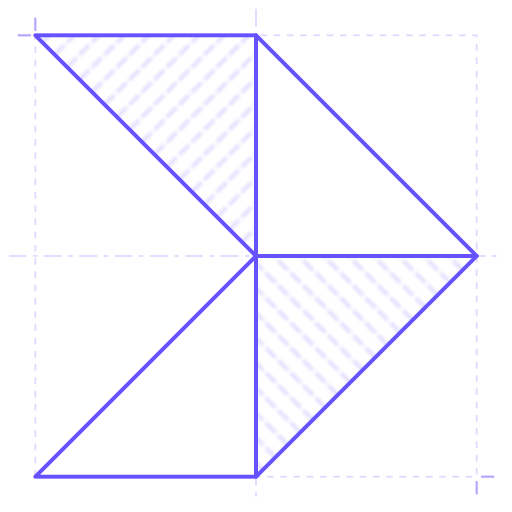
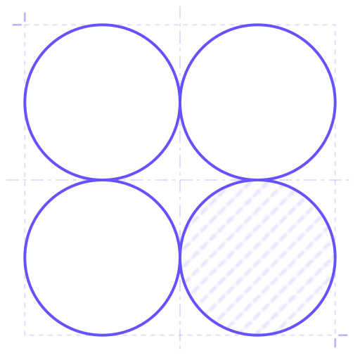
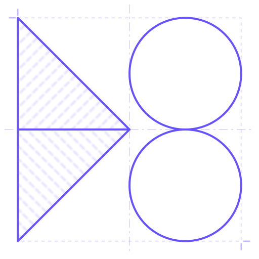
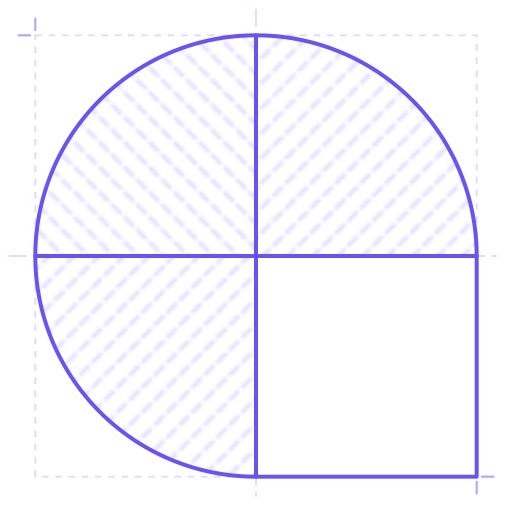
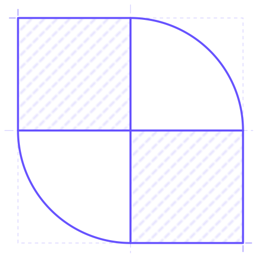
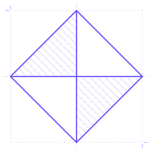
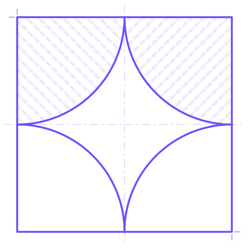
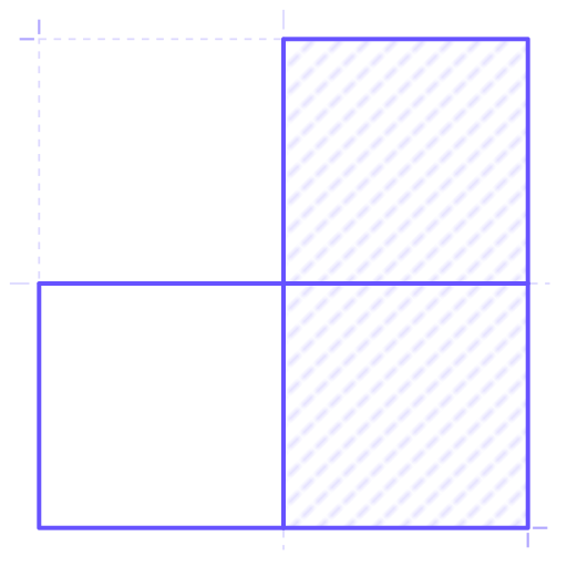
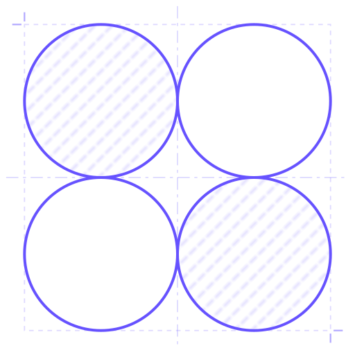
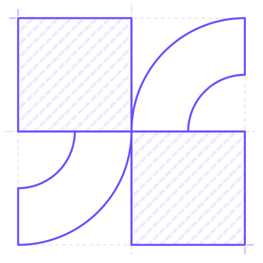
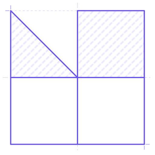
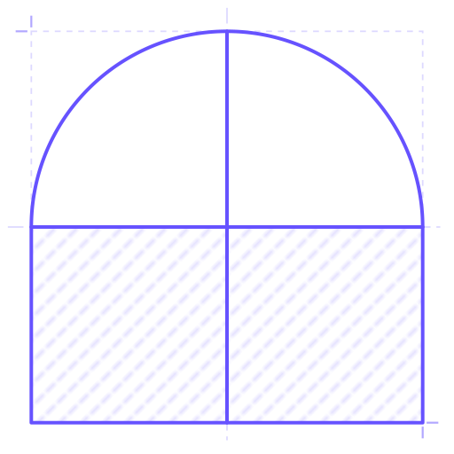
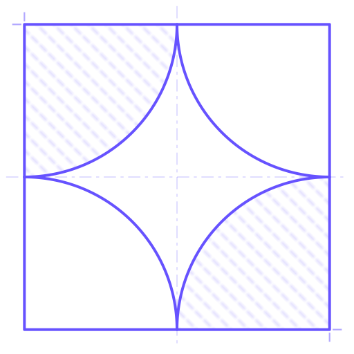
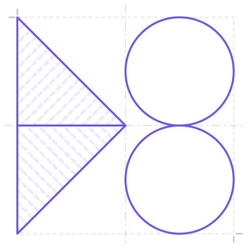
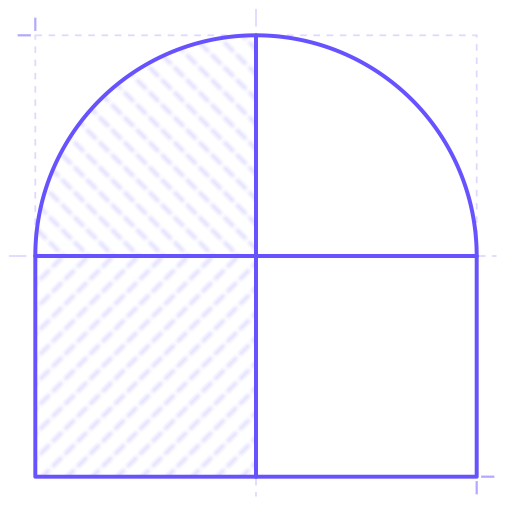
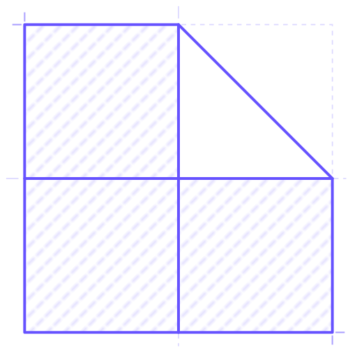
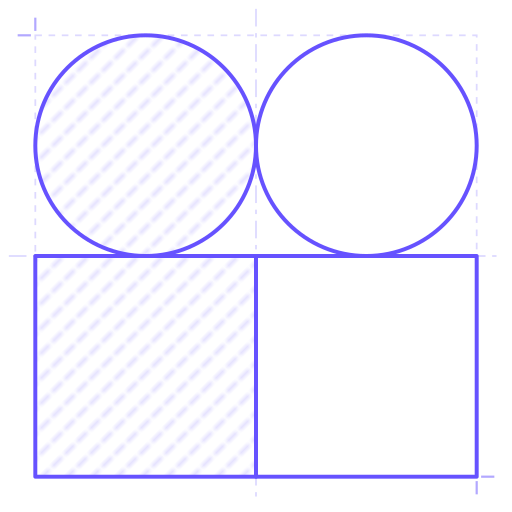
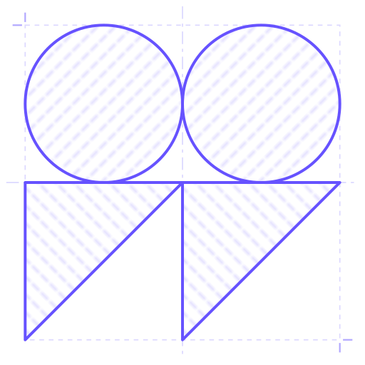
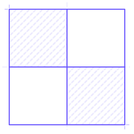
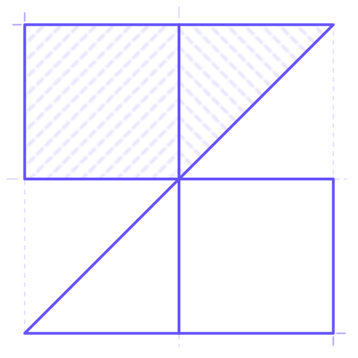
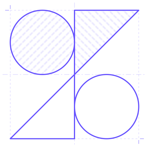
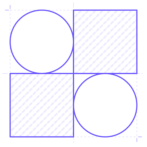
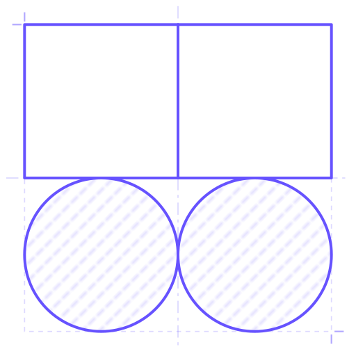
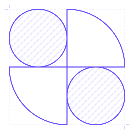
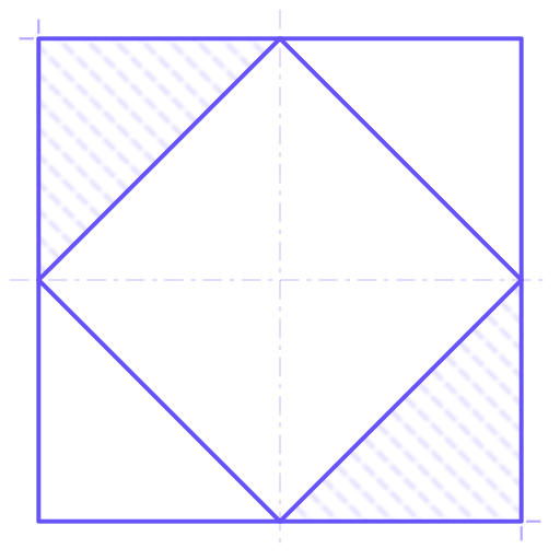
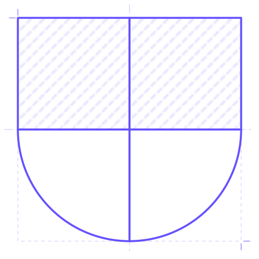
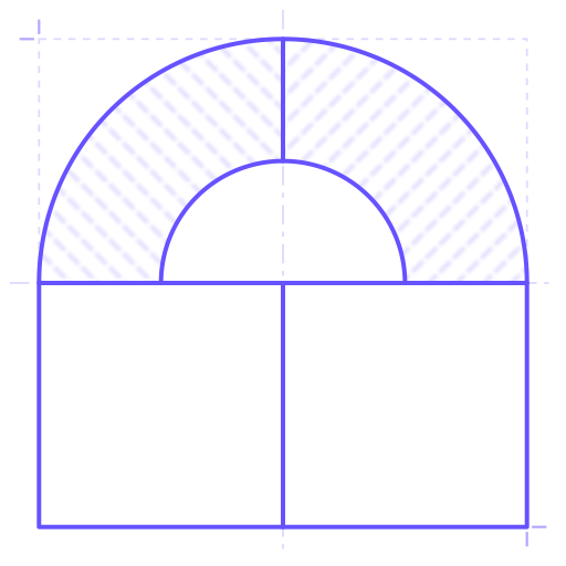
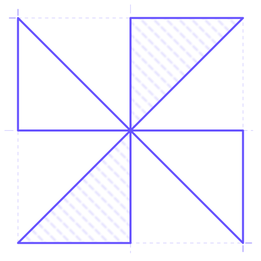
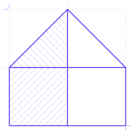
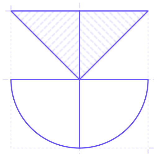
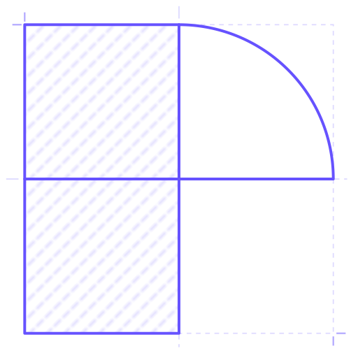
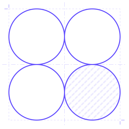
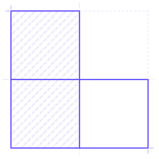
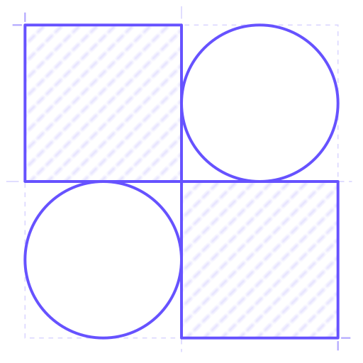
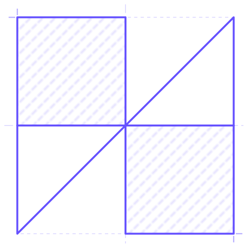
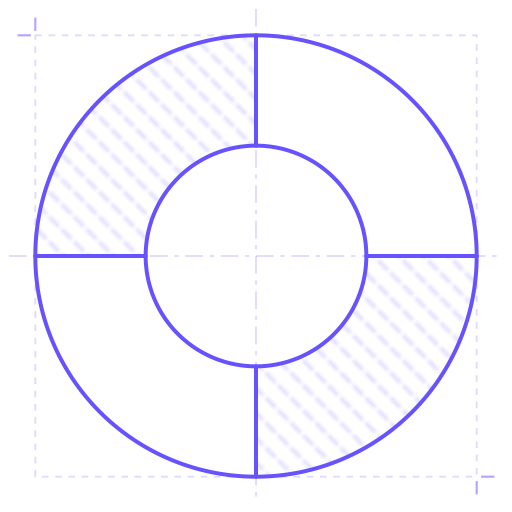
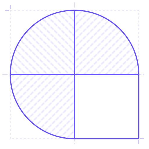
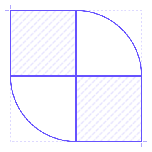
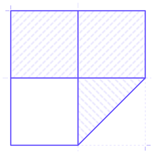
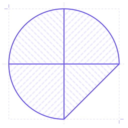
GINC's proprietary marks: 209 of them, every one built on the same grid of four cells and drawn in three versions. The marks in use are among them; the rest are there to be drawn on.
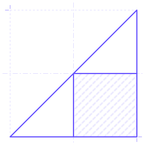
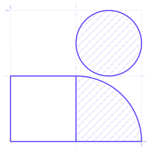
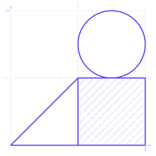
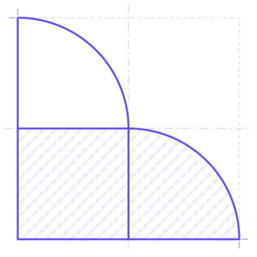
Simulations
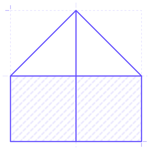
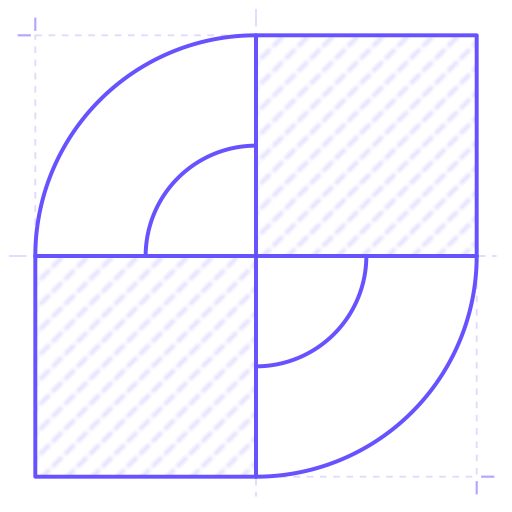
Developments
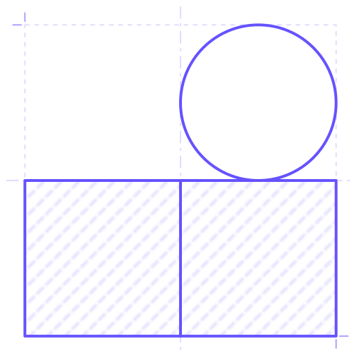
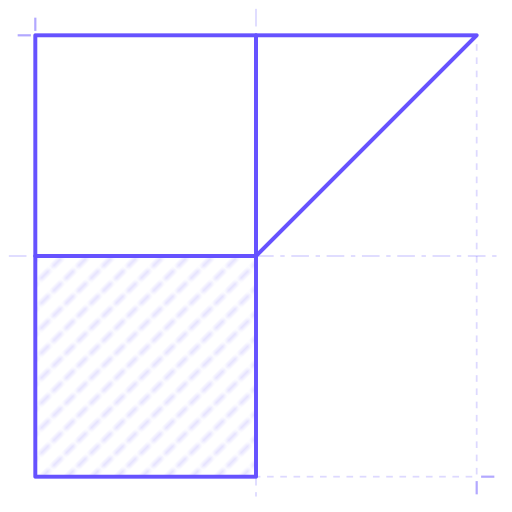
Bilateral Ratings
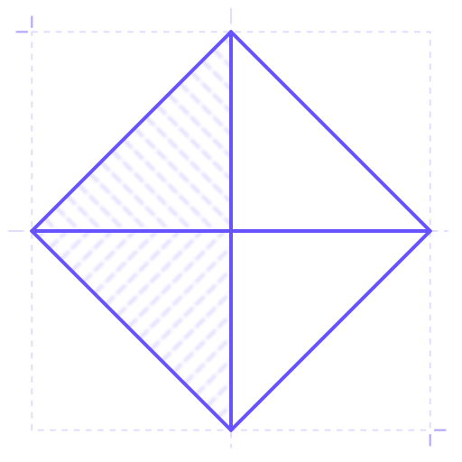
Colour is purple #6652FF and light blue #2EC2FF. Click a mark to download the version shown, as an SVG.